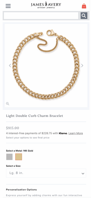
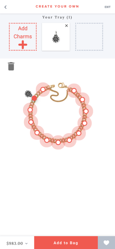
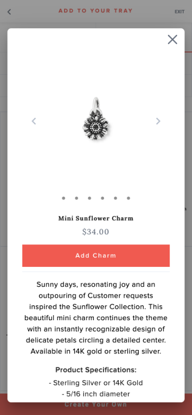
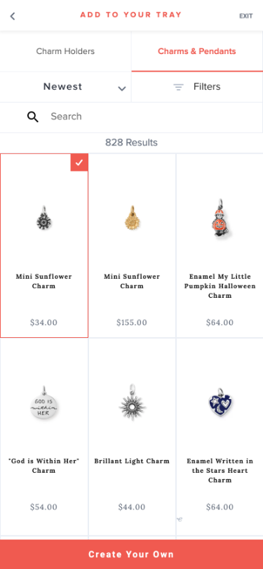
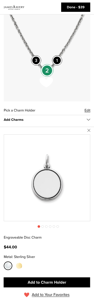
James Avery "Create Your Own" Tool Transformation

James Avery is a national jewelry brand famous for their custom charm bracelets. These multi-generational keepsakes are individually curated to tell a very personal story.

As part of the complete site replatform (View Case Study), the "Create Your Own" tool received an overhaul focused on giving the user the same ability to create one-of-a-kind pieces online.

James Avery Charm Bracelet Filled With Custom Charms

Key Roles

As owner of this project, my role was to drive strategy and the manage end-to-end implementation.

Responsibilities Included:

  • Guiding Business and IT Execution
  • UX Team Management
  • Research & UX Strategy
  • Information Architecture
  • Defining Technical Requirements
  • UI Creation
  • Leading Executive Workshops & Synthesize Feedback
  • General Project Management

Requirements

The tool redesign included comprehensive and diverse functionality which had to be presented to users in a simple and clear way.

As the principal designer it was my task to ensure the backend architecture was well developed and all users flows were accounted for.

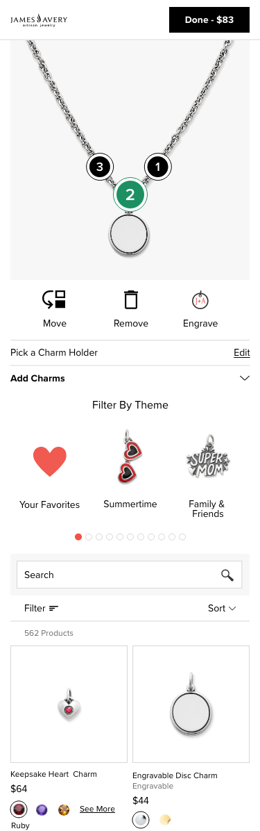
An entire month was spent defining granular technical requirements with Site Merchandising, IT, and the Product Team. This work focused on identifying needs, technically vetting the requests, and prioritizing MVP work.

Lastly, the redesign required a complete visual update to align with the design system created during the replatform.

Research

Since JamesAvery.com had an existing tool I was able to assess user engagement through Google Analytics, heatmaps, and sales data.

Additionally, I conducted competitor research including jewelry builders, shoe customization tools, personalization apps, and more.

James Avery Homepage - Before

Screens from Create Your Own Mobile Tool

UX Strategy

There were a number of major user experience concerns identified during the discovery phase.

These Included:

  • A Large Amount of Backflow from Cart to the PDP
  • Users Were Unable to See Personalization Option Prior to Selecting Variant Details on the PDP
  • Engraving and Adding Charms Were Two Separate Tools
  • Overall the Tool Was Very Linear Causing Many Dead Ends

The strategy was to restructure the architecture to create an experience that felt complete no matter where the user entered from.

It is fairly common for builder tools to present options in a 1, 2, 3 step fashion. This particular solution did not work for our user since there were multiple "step 1". For example, users could enter the tool to engrave, engrave and attach that charm, or only attach a charm.

Through a combination of design and complex functionality we successfully created a circular experience free of traditional steps.

The Goal Was to:

  • Only Show Users the Current "Step" and Then Prompt to Engage with the Next Piece of Functionality.
  • Remove the Tab Style UI to Surface Perviously Hidden Options in Hopes to Increase Usability and Conversion
  • Pull All of the Information in to the Same Area to Reduce Visual Noise
  • Build the New Tool to Function as an App to Also Be Used on In-Store Kiosks

Mobile Before

Screenshot of PDP
Screenshot Select a Charm Screen
Screenshot of CYO Tool Main Page
Screenshote of Switch Charm Holder Screen
Screenshot of Select Charm Holder PLP
Screenshot

Design

As functional lead it was my responsibility to design the all wireframes to visually define each user journey and technical requirements while incorporating the new design style.

It was vital to hold several stakeholder demos during this time to guarantee all business use cases were accounted for.

Once I had established the design perspective, the UX team took over the remaining work needed to create more granular use case mocks and dev notes for IT.

During this period, I pivoted to managing the team workload, hosting design reviews, synthesizing stakeholder feedback, and overseeing IT as they began to implement the designs.

Screenshot of New PDP
Screenshot of New Main CYO Page
Screenshot of Select a Charm Screen
Screenshot of Attach Charm Screen
Screenshot of Engraving Screen
Screenshot of Attach Another Charm Screen

Development

As the dev sprints began I was able to start focusing on all things code.

A largest portion of time during development was spent QAing the code and providing pixel by pixel feedback.

Work Included:

  • Documenting All UX Feedback for IT
  • Managing Bugs/Ticket Prioritization and Backlog
  • Coordinating the Execution of Additional Wireframes
  • Working With Dev to Define Business Rules and Functionality Requirements
  • Collaborating With Marketing to Create New CYO Content and Marketing Campaign

Final Thoughts

This project was the first time I had tackled a builder. I thoroughly enjoyed being able to dive in to the technical side, pairing functionality with an optimized user experience.

I am most proud of creating a circular experience allowing the user to truly "choose their own adventure".

Surfacing the UI on the PDP and exposing all the options in the tool has reduced backflow from the cart and increased conversion, as well as, mobile usability.

Variety of James Avery Charms

Let's Connect

I'd love a chance to collaborate or have a friendly chat.

m.anndailey@gmail.com