Learn365.com Website Design

Oriental Trading Company, known for their large assortment of school supplies, wanted to offer a tailored experience focused on the educator. The goal was to modernize the shopping experience with updated merchandising and branding.

The brand strategy included the creation of a quarterly catalog, new product line, and an online experience for the user to shop and engage with the brand.

This was an 24 month project. Following launch, my support continued through CMS template development and content creation.

Preliminary Style Tile
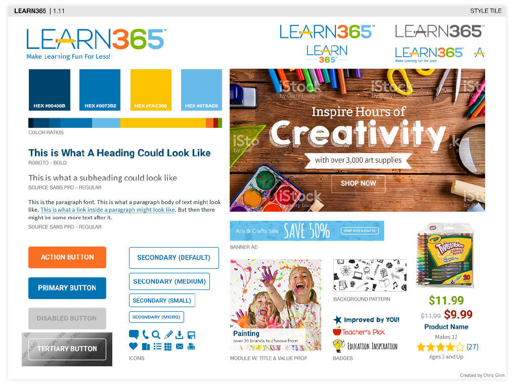
Style tile showing the first draft design direction for Learn 365

Research

Education and non-profit shoppers were very loyal to Oriental Trading Company. Customer loyalty spanned decades when the brand was known for their catalog experience.

Early research focused on curating the vast amount of existing user data in to an actionable set of scenarios. Improved taxonomy, competitive merchandising, and more modern branding were identified as the primary growth opportunities. During the research phase, I wrote scripts for and analyzed sessions using UserTesting.com.

Preliminary Research:

  • Card Sort testing with existing and prospective customers to determine new taxonomy.
  • Comprehensive analysis of existing customer data including buying patterns, demographic, and behavior traits.
  • Competitor White Space Mapping.
  • Moderated wireframe testing.

Development & Design

My primary role throughout the project focused on the following tasks:

  • Developing ADA compliant design standards and conversion optimized web components.
  • Assisting UX developer in producing semantic, ADA compliant markup including troubleshooting and launch support.
  • Facilitating workshops, design reviews, daily scrum meetings and knowledge shares with the executive, site merchandising, marketing and IT teams.
  • Executing on going business priorities through CMS content development.
  • Collaborating with product owners to develop and execute UAT testing.

Font Exploration

One of the largest tasks I took on with the project was identifying marketing fonts that could be used to create banner ads for the site, email, print and social media.

The following outline of desired font styles was provided by the marketing team. The goal was to create a toolbox of graphic elements that allowed designers to easily create multiple aesthetics with a consistant voice.

The following traits were reflective of the brand personas:

  • Inspiring (Somewhat Formal, Lite, Has Personality)
  • Engaging (Bold, Styled)
  • Credible (Simple, Familiar)
  • Authentic (Handwritten, Less Formal)
  • Reliable (Familiar, Comfortable, Basic)
  • Fun (Whimsical, Handwritten, Artistic

Template Used to Evaluate Top 50 Fonts

Marketing font research template

Font Refinement

Research to find the perfect set of fonts included reviewing over 1,000 options.

Multiple design reviews with Key Stakeholders generated a set of 50 strong contenders. The top contending 50 fonts were individually analyzed with the typography template to surface key differences between each typeface (See Example Above).

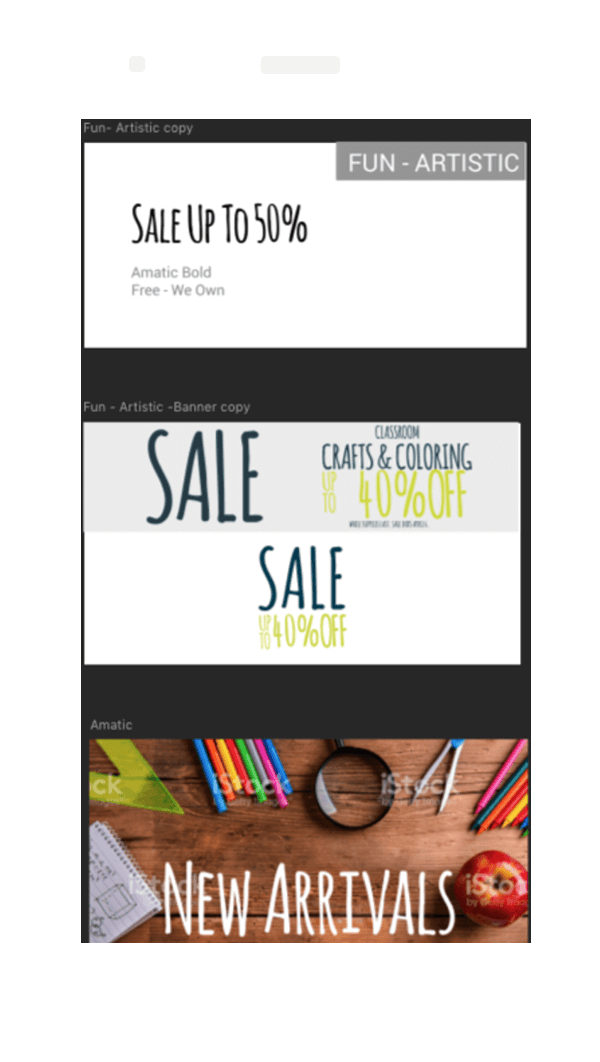
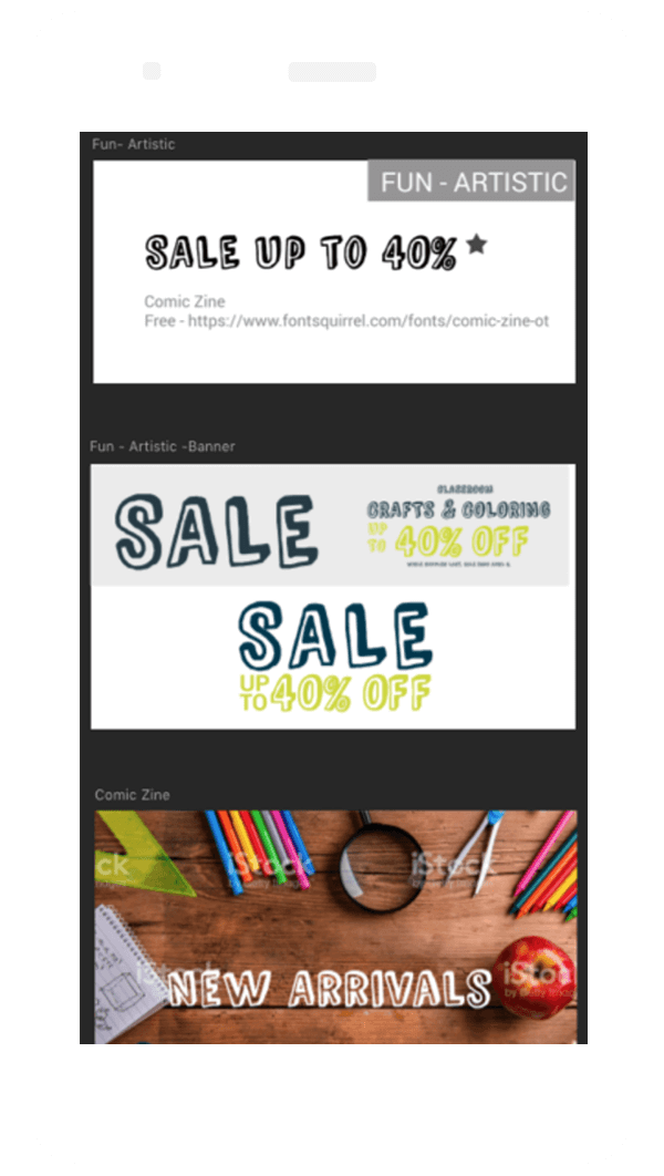
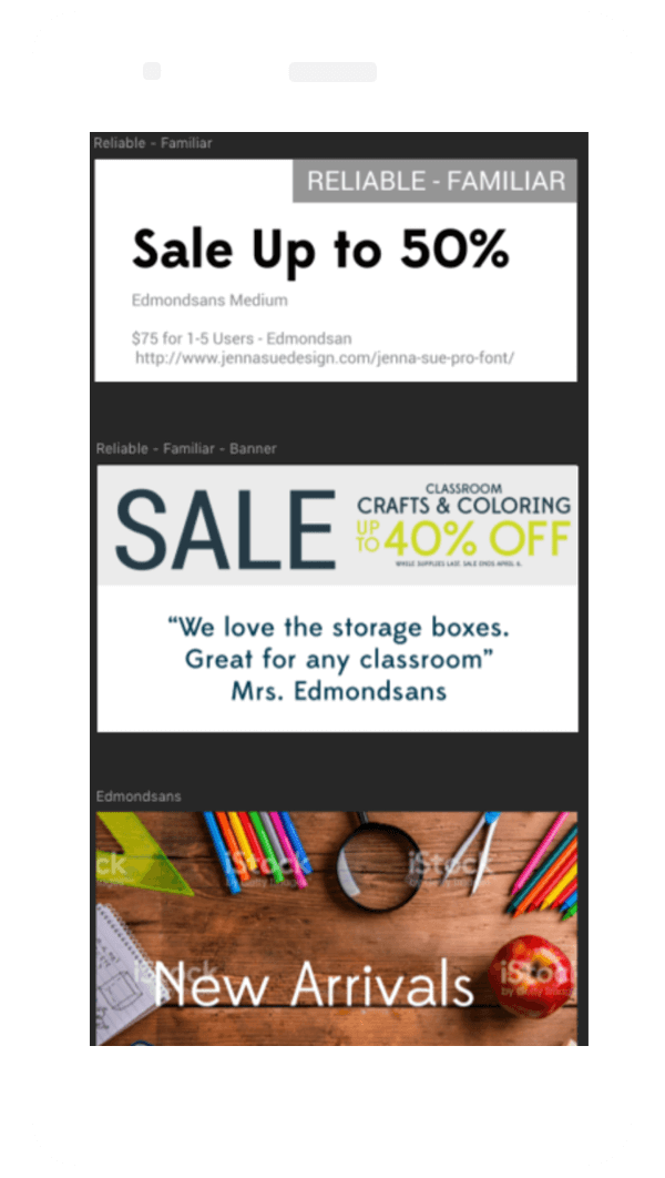
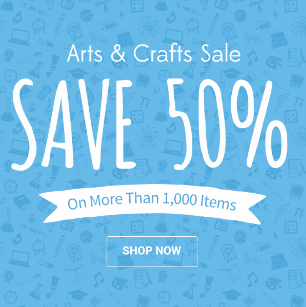
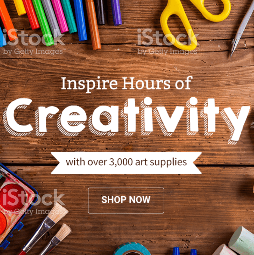
To evaluate how each option presented when color and patterns were introduced, the final 20 fonts were placed in to a web asset template (See Below).

Ultimately, 6 were chosen. Exact fonts, not represented below.

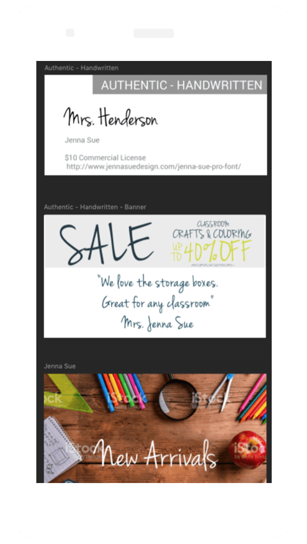
Font Test Using Jenna Sue Font
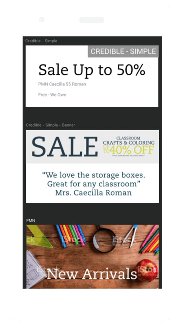
Font Test Using Cecila Font
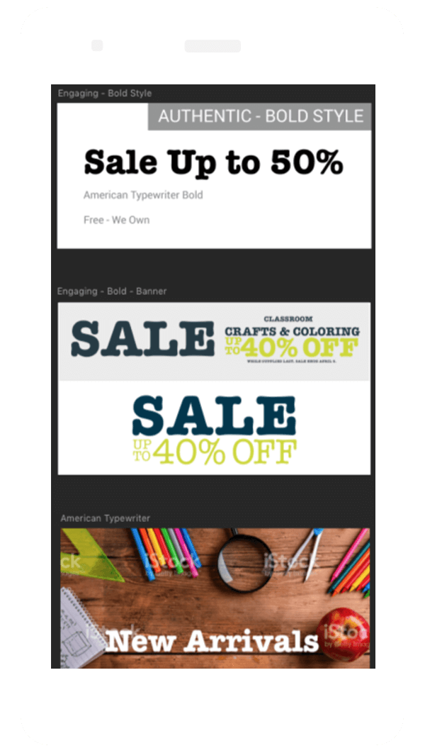
Font Test Using American Typewritter Font
Font Test Using Amatic Font
Font Test Using Comic Zine Font
Font Test Using Edmondsans Font

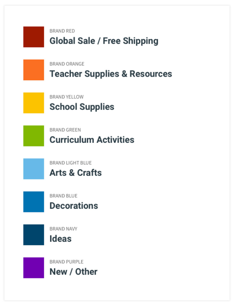
Color Key Created for Designer Toolbox

Color guide to help designers know when to use colors

Graphic Standards

A set of easy to apply practices was developed to guarantee optimized asset design. The digital standards were created using the logo and color palette provided by the branding team.

Part of the strategy was to create an easy to follow matrix for font selection which included the following guidelines:

  • 1 to 2 Words Should Be Extra Large
  • Extra Large Text Should be Bitter (Bold), Happy (Regular), or Amatic (Bold) - No Combination of Them
  • Supportive Copy Should be Bitter (Regular), Source Sans Pro (Regular), or EdmondSans (Regular)
  • There Always Needs to be a Button With a Call to Action and the Font Should be Roboto (Bold) in All Caps
  • The Button in Marketing Spots Should be the "Tertiary Button" from the Style Tile and it can be in the Same Color as the Supportive Copy

Asset Design

Mockups created to showcase various aesthetics when following the Design System.

Font Test Using Jenna Sue Font
Font Test Using Cecila Font
Font Test Using American Typewritter Font

Development

Following the development of the navigation, plp, pdp, and cart interfaces, I transitioned from design to focus on the technical development of the CMS templates for the following experiences:

  • Homepage
  • Top Level Category Pages
  • Landing Pages
  • PLP Merchandising
  • Mega Menu Promotional Ad Spots
  • Informational Content Pages

Additional Development Tasks:

  • Facilitated protoype interaction review workshops with executive team using Invision.
  • Led site merchandiser training focused on the use of HTML templates.
  • Provided UX developer and IT technical support.
  • Wrote and executed UAT testing.
  • Developed email templates

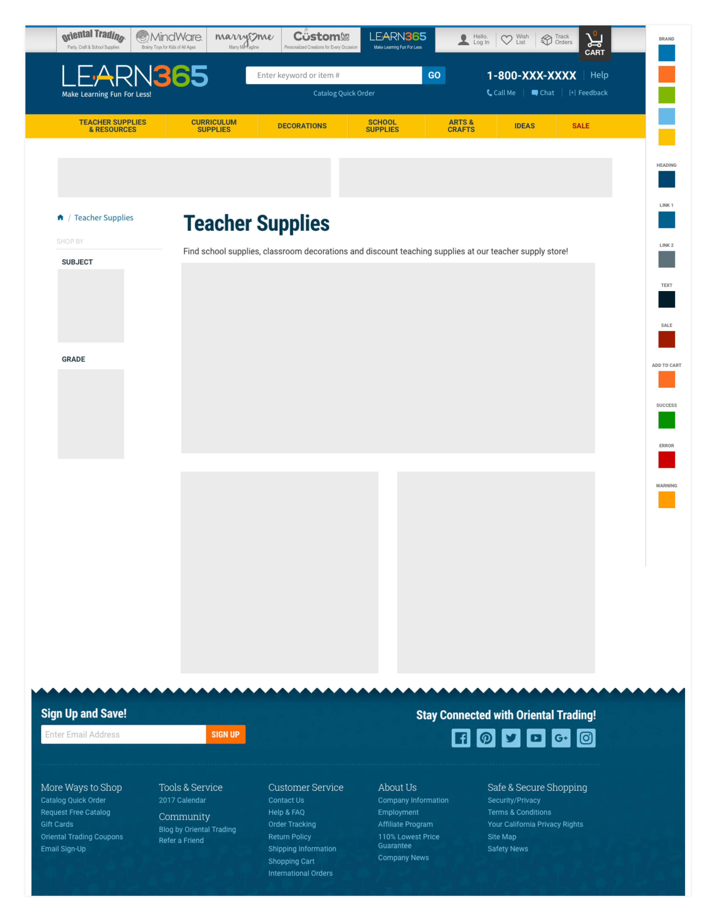
Preliminary Wireframe

Wireframe of the Learn365 top category page layout

Early Hero Mockup

Content

In partnership with the site merchandising team, content creation took over a month to complete.

Open collaboration during this phase was key to our success as a team. Throughout this process, there were many pivots initiated by viewing the UI, UX and content together.

Testing was conducted to ensure the user journey was clear and both the content and functionality, met the needs of the user.

Additionally, I was tasked with developing and producing content for pre-launch, launch, and post-launch omni-channel communication.

Fun and Functional

Creating this site was personal, as the daughter of an elementary principal who spent her formative years surrounded by hard working teachers. My childhood was spent flipping through the OTC catalog in my Dad's office.

My mission was to create an experience that gave the educator something just for them.

  • Faster shopping, often done over their lunch break, through intentional taxonomy and merchandising.
  • Fun and relevant branding to support current curriculums.
  • Competitive pricing and messaging to help make the most of every dollar spent.

Overall, I am most proud of the Design Toolbox we created. The approach worked so well, it has been replicated in many of my other projects.

Launch Ready Homepage

Style tile showing the first draft design direction for Learn 365

Let's Connect

I'd love a chance to collaborate or have a friendly chat.

m.anndailey@gmail.com