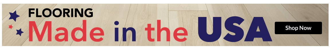
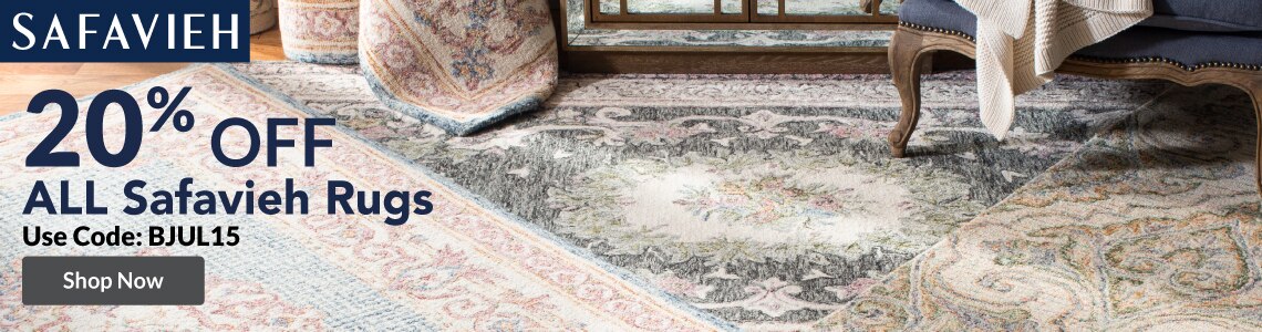
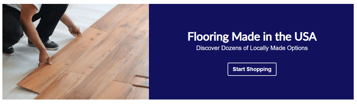
Conversion Optimization

Conversion Optimization is my true passion. Similar to finding coins in the couch cushions, I am a big believer in small changes compounding into a big effect.

One of my favorite ways to present the monetary impact of small changes is to present before and after visuals along side the data.

Using the same resources as my peers, I generate an average of 115% more conversion following an update.

Below is collection assets optimized for increased conversion.

Control

Banner with a rug image in the background for Safavieh Rug at 20% Off

Test

Banner with a light grey background Safavieh Rug at 20% Off

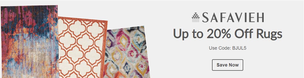
Minimal Design - Web Banner

The hypothesis was the Web Asset that mimicked the UI of the site would convert at a higher rate.

Test Approach:

  • Create a responsive rich text asset versus a static asset to improve legibility at all sizes.
  • Based on previous testing, use a knockout image in place of a lifestyle image.
  • Mimic typography and background UI patterns to give the appearance of a category module.
  • Improve readability by placing the brand logo on the top line and making the value prop copy equal size.

Results

  • +80% Conversion Lift

UX Best Practices - Web Banner

The hypothesis was creating a banner that followed our proven UX Best Practices would increase conversion.

Test Approach:

  • Create a responsive rich text asset versus a static image to improve legibility at all sizes.
  • Select an image that more clearly communicated the subject of the asset.
  • Rewrite copy to improve comprehension and speed to click.
  • Based on previous CTA testing, update button copy to "Start Shopping" to improve clicks.

Results

  • +3,332% Conversion Lift

Control

Banner with a flooring background - Made in the USA - Shop Now

Test

Banner with an image of a man installing flooring - Flooring Made In the USA - Discover Dozens of Locally Made Options - Start Shopping

Before - Single Landing Page

Holiday's Made Easy Landing Page showing multiple services represented by icons.

After - Reusable Module

Image of Cheering girl wearing holiday sweater next to content feature the holiday categories

Campaign Strategy & Design

The Holidays Made Easy campaign informed users of the services NFM offered during the holiday season. The previous approach was to direct all traffic to a centralize landing page.

While reviewing YOY analytics we identified the majority of the content generated low engagement. This caused us to change the overall strategy of content presentation.

Redesign Approach:

  • Place content on the homepage and relevant product list pages.
  • Drive traffic to the homepage module.
  • Add more visual interest by replacing the iconography with photography to mimic the UI of product categories.
  • Bring the Gift Guide to the top of the content block based on previous experience analytics.
  • Give top hierarchy to the categories that had the ability to convert on site.
  • Introduce visual excitement through the use of photography featuring a person cheering.
  • Work with our third-party Gift Card partner to add and track sales data for the 2019 season.
Results
  • +1497% Revenue
  • +237% Click Through Rate

Paid Ad Strategy

Previously non-branded paid ads were directed to the top level category page. When landing, the user was first presented with additional ads and scrolling was required to view product categories.

Analytics for the existing experience had reported an 80% bounce rate.

Click data determined users engaged with the "Shop By Size" widget 3X more than any other link on the top level page.

Redesign Approach:

  • Direct all referral traffic directly to the product list pages with a "Shop By Size" widget
  • Introduce iconography in the "Shop by Size" widget to increase speed to click by improving comprehension.

Results

  • -48% Bounce Rate
  • +56% Time on Site

Before - Mattress Top Level Page

Holiday's Made Easy Landing Page showing multiple services represented by icons.

After - Mattress Product List Page

Image of Cheering girl wearing holiday sweater next to content feature the holiday categories

Landing Page Redesign

The Drive Thru Pickup landing page redesign was completed in time for Holiday 2019. Reworking this experience within months of the Pandemic set us up for success during the early days when most retailers were scrambling to integrate curbside.

No additional resources were provided but we believed minimal optimizations would result in a sizeable gain.

Redesign Approach:

  • Design a minimal hero image with simple copy to quickly convey the page content, overall reducing bounce rate.
  • Add simple iconography to visually convey the ease of use.
  • Include regonialized Same-Day merchandising to monetize the experience.

Results:

  • -16% Bounce Rate
  • -30% Exit Rate
  • +218% Page Value

Before

Screenshot of Free and Fast Landing Page Before the Change

After

Screenshot of Free and Fast Landing Page After the Change

Let's Connect

I'd love a chance to collaborate or have a friendly chat.

m.anndailey@gmail.com